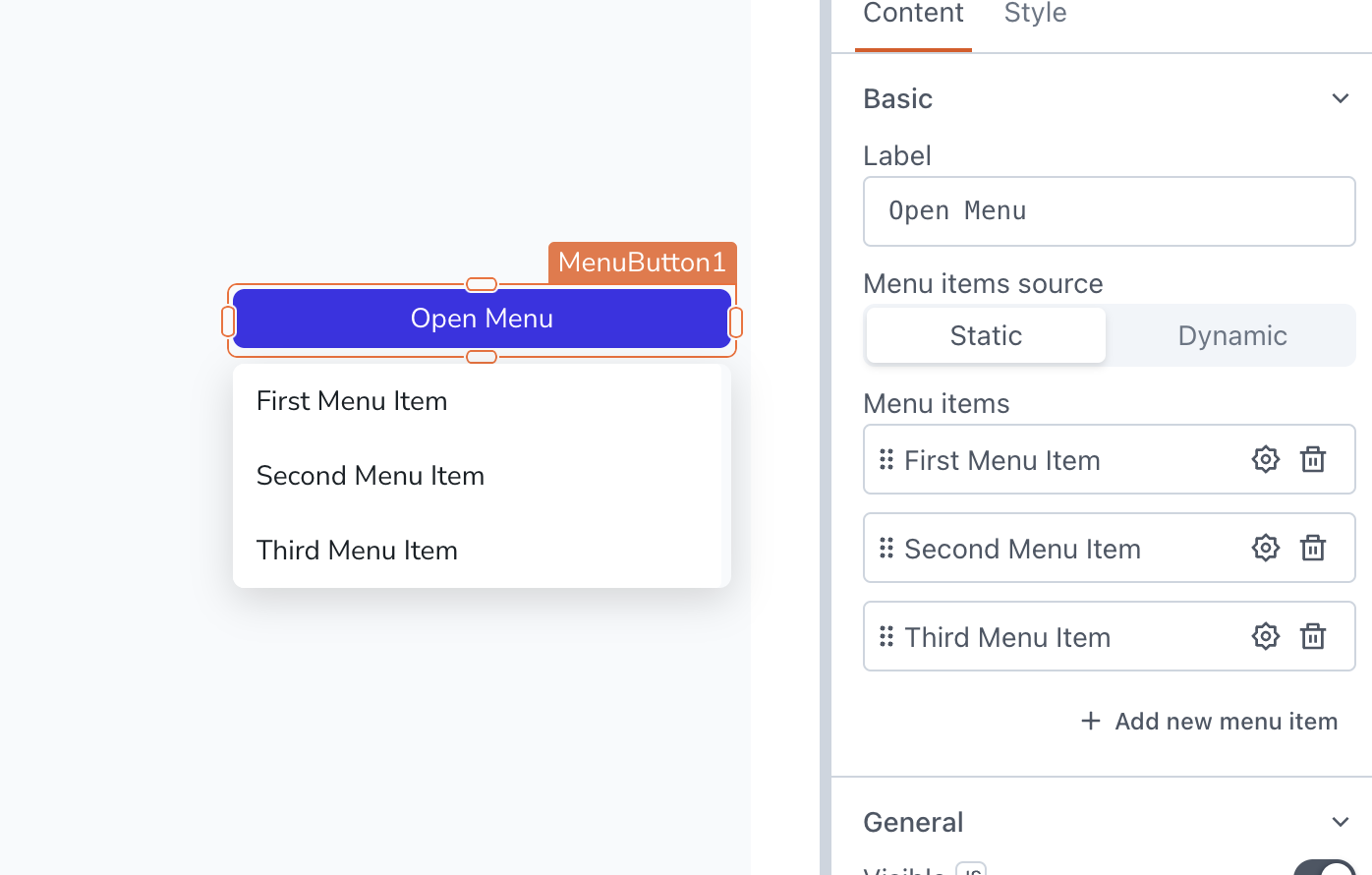
Menu Button
This page provides information on using the Menu Button, which allows you to create customizable dropdown menus with a range of options for user selection.

Content properties
These properties are customizable options present in the property pane of the widget, allowing users to modify the widget according to their preferences.
Basic
Label string
Menu items source string
Allows you to specify the source of the menu items.
Options:
- Static: When the Static option is selected, the Menu Items property would be visible, allowing you to add and manage the menu items directly from UI. You can click on the ⚙️ gear icon to access the configuration options.
- Dynamic: With Dynamic source, the menu items are populated dynamically by binding the query to Source data. To configure the properties of the menu items, click on the Configure Menu Item button. The menu items would not be displayed until you configure them using the
currentItemorcurrentIndexproperty.
The dynamic menu option supports a maximum of 10 menu items.
Menu items string
Source data array
It is used to provide the datasource for dynamic menus. It accepts an array of values, which can be obtained from queries. You can directly reference your query in the Source Data property, like:
{{fetchData.data}}
If the data retrieved from the query is not in the desired format, you can use JavaScript to transform it before passing it to the widget. For instance, if you have a list of product names and you want to display only the unique names in a Menu Button, you can use:
{
    {
        fetchData.data.reduce((acc, cur) => {
            const existingItem = acc.find((item) => item.value === cur.name);
            if (!existingItem) {
                acc.push({ label: cur.name, value: cur.name });
            }
            return acc;
        }, []);
    }
}
The code filters the data to create a new array with unique items based on the type property.
General
Visible boolean
Controls the visibility of the widget. If you turn off this property, the widget is not visible in View Mode. Additionally, you can use JavaScript by clicking on JS next to the Visible property to control the widget's visibility conditionally.
For example, if you want to make the widget visible only when the user selects "Yes" from a Select widget, you can use the following JavaScript expression:
{{Select1.selectedOptionValue === "Yes"}}
Disabled boolean
Prevents users from selecting the widget. Even though the widget remains visible, user input is not permitted. Additionally, you can use JavaScript by clicking on JS next to the Disabled property to control the widget's disable state conditionally.
For example, if you want to allow only a specific user to select menu item, you can use the following JavaScript expression:
{{appsmith.user.email=="john@appsmith.com"?false:true}}
Animate Loading boolean
Controls whether the widget is displayed with a loading animation. When enabled, the widget shows a skeletal animation during the loading process. Additionally, you can control it through JavaScript by clicking on the JS next to the property.
Compact boolean
Style properties
Style properties allow you to change the look and feel of the widget.
General
Button variant string
Specifies the style type of the button to indicate its significance.
Options:
- Primary: Fills the button with color.
- Secondary: Adds a colored border to the button while keeping the button itself white.
- Tertiary: This option does not apply any specific styling changes to the button.
This property can be dynamically set using JavaScript by providing a string value of PRIMARY, SECONDARY, or TERTIARY.
Icon
Icon string
Specifies the icon to be displayed on the button. Additionally, you can use JS to dynamically set the icon. You can refer to the documentation of blueprintjs to explore a wide range of available icons.
Position string
This property allows you to configure the Icon's placement.
Options:
- Left: Aligns the Icon to the left side of the Label.
- Right: Aligns the Icon to the right side of the Label.
Placement string
Determines the spacing between the Icon and the Label.
Options:
- Start
- Center
- Between
Color
Button color string
Represents the color of the button, specified as a CSS color value. Additionally, the font color can be programmatically modified using JavaScript functions.
Border and shadow
Border radius string
Applies rounded corners to the outer edge of the widget. If JavaScript is enabled, you can specify valid CSS border-radius to adjust the radius of the corners.
Box Shadow string
This property adds a drop shadow effect to the frame of the widget. If JavaScript is enabled, you can specify valid CSS box-shadow values to customize the appearance of the shadow.
Reference properties
Reference properties are properties that are not available in the property pane but can be accessed using the dot operator in other widgets or JavaScript functions. They provide additional information or allow interaction with the widget programmatically. For instance, to get the visibility status, you can use MenuButton1.isVisible.
Label
Example:
{{MenuButton1.label}}
isVisible boolean
The isVisible property indicates the visibility state of a widget, with true indicating it is visible and false indicating it is hidden.
Example:
{{MenuButton1.isVisible}}
Methods
Widget property setters enable you to modify the values of widget properties at runtime, eliminating the need to manually update properties in the editor.
These methods are asynchronous, and you can use the .then() block to ensure execution and sequencing of subsequent lines of code in Appsmith.
setVisibility boolean
Sets the visibility of the widget.
Example:
MenuButton1.setVisibility(true).then(() => {
  // code to be executed after visibility is set
})
setDisabled boolean
Sets the disabled state of the widget.
Example:
MenuButton1.setDisabled(false).then(() => {
  // code to be executed after disabled state is set
})
